With Five Times As Much Warming
Just what do all the squiggly lines mean? To start with, the way science is shown to us civilians is a bit misleading generally. What we hear much of the time as the “new record sea ice extents” is based on averages. Averages are meaningful statistically, but it’s not the averages that create the worst trouble; it’s the extremes. Average rainfall, average temperature, etc.; not much damage occurs from averages.

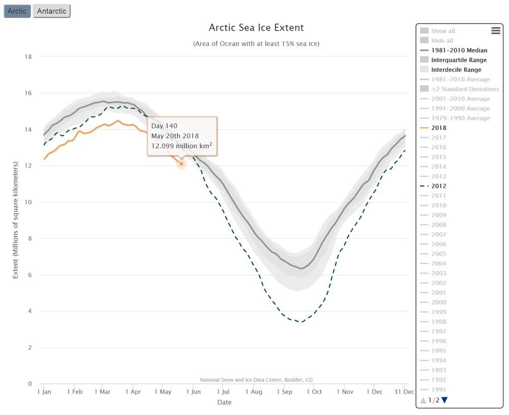
Arctic Sea Ice Extent from the National Snow and Ice Data Center. The gray is the 1981 to 2010 average range with the black line in the center as the average. The dark green dashed line shows the record low summer ice extents in 2012.
The record minimum summer Arctic Sea ice extents was set in 2012 at 1.290 million square miles. That’s a lot of ice, but it is only 44 percent of the 1981 to 2010 average minimum summer extents. This great loss of sea ice is really important, but what this article focuses upon is how the way science is communicated to the public can be quite misleading.
Because statistics matter, especially with our widely variable weather and earth systems, scientists have realized that the average of the last 30 years of these weather or earth systems events reveals a more precise statistical definition. Because science is based on precision, averages are used to convey most information. But because finite precision is not that important when it comes to extremes, often a better way to look at things does not involve averages; and here’s why:
The record minimum 2012 is compared to the 1981 to 2010 average that includes recent sea ice extents. Because Arctic sea ice has been declining steadily since we have been measuring it accurately with satellites beginning in 1979, the “1981 to 2010 average” is very likely skewed or biased low relative to earlier time frames.
In the graphics shown in this article, the average 1981 to 2010 range of sea ice extents is shown in the broad gray area with the average of 1981 to 2010 shown as the solid black line in the middle of the gray. The record 2012 year is the dashed dark green line.
In the graphic below, the years 1979 to 1986 are shown to allow an understanding of how the 1981 to 2010 average is lower than that from earlier years. Statistically, a shorter average sometimes is not very precise, but it is meaningful in general terms, especially when understanding extremes.

Just the years 1979 through 1986 are shown. It is easy to see that these years were all higher than the average from 1981 to 2010.
When we look at the maximum minimum arctic sea ice extent over the period of satellite observation, we get a broader understanding of how much sea ice has declined. The 7.553 million square kilometers shown in the graphic above (2.916 million square miles) is the largest minimum (the maximum minimum) Arctic sea ice extent that has been recorded since satellite observations began–at the end of summer when sea ice is the lowest. When we compare the record year of 2012 to the maximum minimum, we see that sea ice extent has decreased 56 percent. This is nearly a third less than if we just look at averages.
The area of ice lost is two and one half times the size of Alaska, five times the size of Texas, or significantly more than half the size of the Lower 48.
Because ice reflects up to 90 percent of sunlight harmlessly back into space, and open water (and plants and dirt and rock) absorb up to 90 percent of sunlight and turn it into heat that can be trapped by the greenhouse effect, the picture becomes even more stark. Surfaces that are not snow and ice absorb up to nine times more heat than does snow and ice.
This is called the snow and ice feedback or the albedo feedack. (Albedo means whiteness.) Looking at the big picture, when we understand that about half of sea ice is gone at the end of the melt season, this does not equal half again as much warming, it means the Arctic is experiencing about five times as much warming.
It is these nonlinear changes that are created by warming that can lead to abrupt changes that are far more extreme than suggested by “averages.” (and averages BTW are what are projected from climate models–upon which climate policy is based.)
Another important bit: the extra warmth caused by the loss of sea ice is responsible for about as much ice loss on land as in the ocean. This is because a warmer ocean creates a warmer environment where warmth is spread to land, melting about as much more ice on land as is now gone over the Arctic Ocean.
Peter Wadhams, one of the longest practicing polar ice scientists still practicing, tells us in his new book A Farewell to Ice (highly recommended), that because of the snow and ice feedback in the Arctic, we are seeing about as much warming as we are seeing from the rest of mankind’s excess greenhouse gas emissions combined. This basically means that starting now, if we do not cool Earth and allow her to continue warming, earth systems feedbacks are responsible for more warming than all of mankind’s excess greenhouse gas emissions since we began emitting them over 200 years ago.
This is a really big deal. What it means is that because of the great delay in action to control global warming, Earth’s systems are now in control.
The link to the interactive graphic shown in the images in this article can be found at the National Snow and Ice Data Center Interactive Sea Ice Extent Chart.
There is much more information on current Arctic sea ice conditions at the National Snow and Ice Data Center Website.
Statistics from the National Snow and Ice Data Center:
Minimum 2012 1.290 million square miles
Minimum 1979-1986 2.470 million square miles
Average 1981 to 2010 2.285 million square miles
Decline from 1981 to 2010 44%
Decline from 1979 to 1986 48%
Maximum minimum, period of record 2.916 million square miles
Decline from max min 56%
Area of decline from minimum maximum 1.626 million square miles